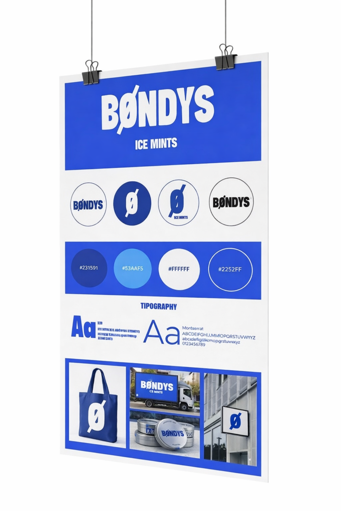
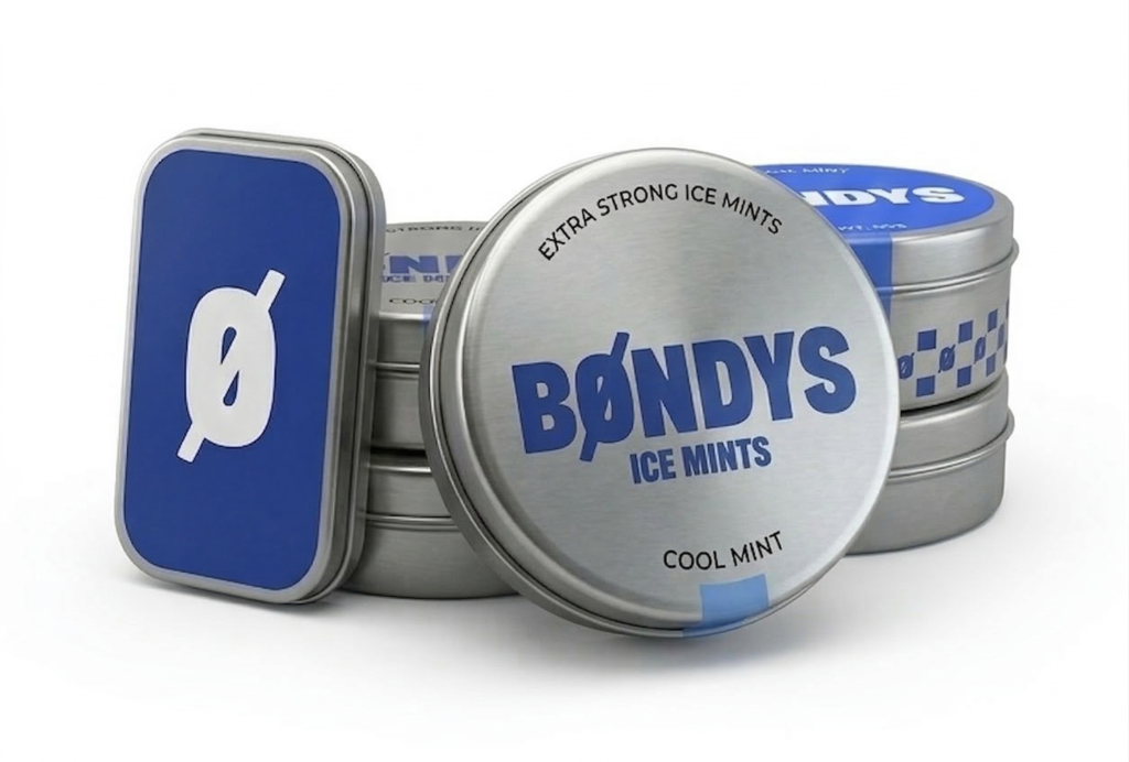
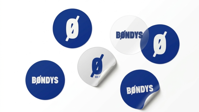
Bøndys Ice Mints is a conceptual branding project focused on creating a modern and memorable identity for a mint product. The visual identity is built around a minimalist “Ø” symbol, representing freshness and purity while serving as the brand’s main graphic element. A palette of cool blue tones reinforces the idea of ice and freshness, while bold typography gives the brand a strong and recognizable personality.